200dtd-bike-maintenance-system
Sprint 1 - A Working UI Prototype
Sprint Goals
Develop a prototype that simulates the key functionality of the system, then test and refine it so that it can serve as the model for the next phase of development in Sprint 2.
Figma is used to develop the prototype.
Initial Database Design
This is the initial design for the database, linking tasks to specific bikes. Tasks and bikes can have various bits of data attached. Tasks have a field that allows a number of days to wait before the task repeats (0 days means a non-repeating task):
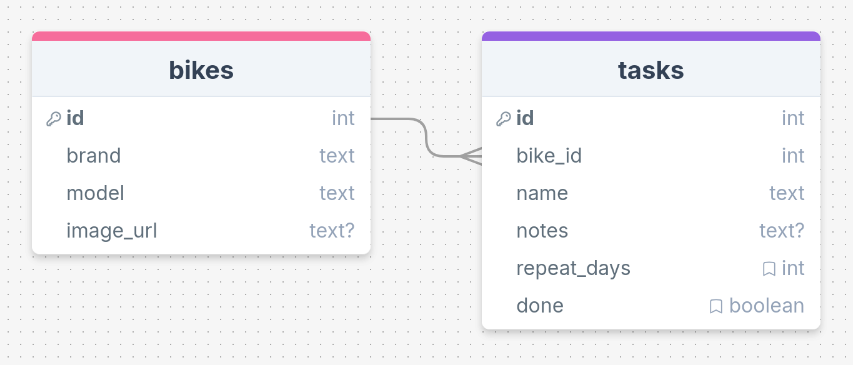
After talking with some potential end-users, we realised that the repeating tasks won’t work unless a date field exists too - this will be filled in when a repeating task is completed, adding the repeating days to the current date to calculate the next due date. When this date is reached, the task will be marked undone again. Also, we added a help URL field to allow for links to websites / videos with help for the specific task:
UI ‘Flow’
The first stage of prototyping was to explore how the UI might ‘flow’ between states, based on the required functionality.
This Figma demo shows the initial design for the UI ‘flow’:
Testing
I gave this demo to some potential end-users to see if they had any comments / feedback. These issues were raised:
There is no way to get back from the Bike Details screen to the home screen so that the user can swap to a different bike.
It would be good to see a list of all tasks for all bikes in one place
Changes / Improvements
I updated the UI flow diagram:
- Added a back button from the Bike Details screen to go back to the Home screen
- Added a link from the Home screen to an All Tasks Screen
Here is the updated UI flow:
Further Testing
Sharing this again with end-users, they seemed happy with the overall flow. We agreed that marking a task done should take you back to the specific bike screen, even if you came from the All Tasks screen.
The end-users were happy to move forward with the design.
Initial UI Prototype
The next stage of prototyping was to develop the layout for each screen of the UI.
This Figma demo shows the initial layout design for the UI:
Testing
I showed this mock-up of the system UI to a number of potential end-users and gave them a chance to interact with it.
I asked them to comment on the usability of the system (bearing in mind Nielsen’s Usability Heuristics) and also the system functionality. I asked them to ignore colour / font choice for now.
This is the feedback I obtained:
The system works well and is pretty simple to use. I didn’t need any help to work out how to use it.
I like the layout of each screen - it is simple and clear.
I would like to see a count of tasks for each bike on the home screen so that you can see which bikes need work doing.
Tasks should have a priority so that I can set some as important, and others not. Then the most important ones could be shown at the top of the task list
Changes / Improvements
Based on the above feedback, I updated the UI design with some changes:
- Task count for each bike
- Task priority (this needed a database update too)
This is the updated UI design:
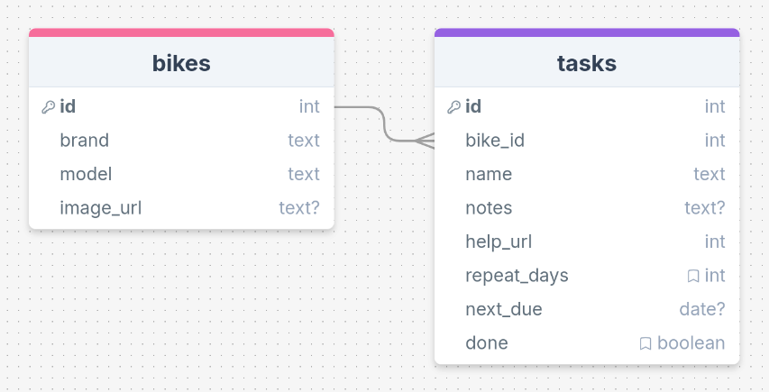
And this is the updated database with an ‘important’ field added to the tasks table:
Further Testing
Showed this updated version to the end-users and got the following feedback:
The task count really helps you to see what needs doing, right form the home page
It might be nicer to use a star symbol for high-priority tasks, but otherwise I like the way some tasks can be marked as extra important.
The users were happy to continue with this design.
Refined UI Prototype
Having established the layout of the UI screens, the prototype was refined visually, in terms of colour, fonts, etc.
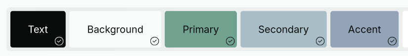
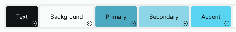
Colours
I explored some colour palettes that I thought would work well. I used the Realtime Colors website:
Testing
Both of these palettes scored well on contrast, so work in terms of accessibility.
I showed the palettes to some end-users to see if they had a preference:
- 3 users preferred Palette 1
- 5 users preferred Palette 2
- 2 users liked both
So, based on this, I’ll go ahead with the second palette and apply it to the UI design
UI with Colour
This Figma demo shows the UI with refinements applied:
Testing
The end-users were shown the UI design with the colour palette applied and asked to evaluate it:
The colours are clean and simple. They don’t distract. Everything is easy to see and read.
I like the blues. They make the app look clean and modern.
I like the blue colours, but I would like a dark mode. The white is too bright.
Changes / Improvements
Based on the feedback above, I produced a second version with a dark mode, using the same blue palette.
I will try to make this a user-choice when using the web app.
Testing
The user who mentioned the dark mode liked the updated design.
The dark mode is a good improvement - Easier on my eyes!
I think that the design does not need further refinement at this point.
Sprint Review
Overall, I think that this sprint has been really successful. I have a clear idea of what the system should do, what it should look like and my end-users are pleased with the progress so far.
I feel that I am now ready to move on to creating the web app.